A Case Study
Chapman’s Carpet Cleaning Redesign
The project began as a client project, but revisions were made after completion to accomodate a class assignment.
Title & Summary:
A logo with a clean color scheme for a carpet cleaning business, designed to be put on a business card.
Project Details:
My Role:
Solo designer
Tools:
Procreates, Illustrator, & Photoshop
Tools:
2 weeks
Client-work
The Challenge:
The client wanted a personalized business card similar to the owner’s, but one that set him apart. I wanted to develop an original concept that shifted away from the Scrubbing Bubbles theme. Sketching takes me some time, since I’m not the best at it. Then, I also used Illustrator, which was the most challenging part.
The Research:
Step 1:
Colors
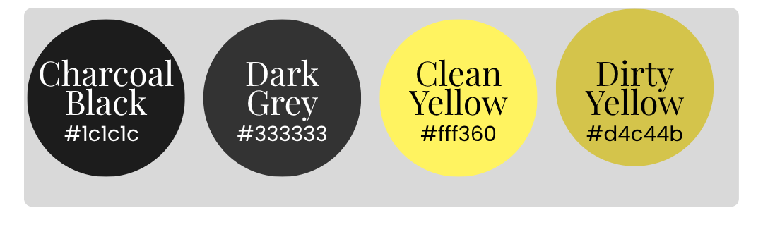
I looked up colors that signaled cleanliness while also giving masculine energy. The brand colors I used are Charcoal Black, Dark Grey, Clean Yellow, Dirty Yellow, and White.
Step 2:
Research
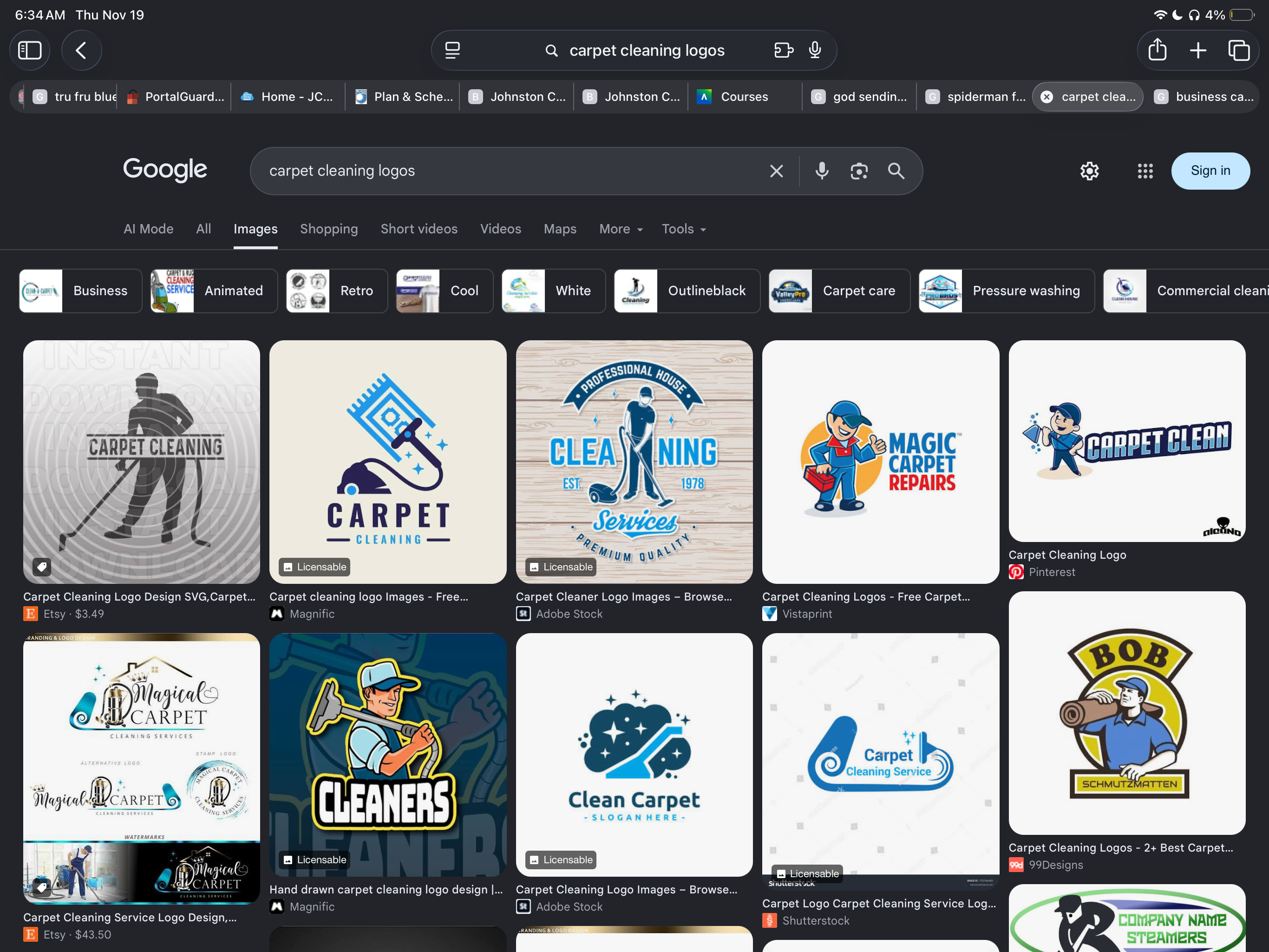
I looked up carpet cleaning logos. I felt that the logos looked similar in terms of color and feel. I felt that the client would want something that sets him apart.
Step 3:
Sketch
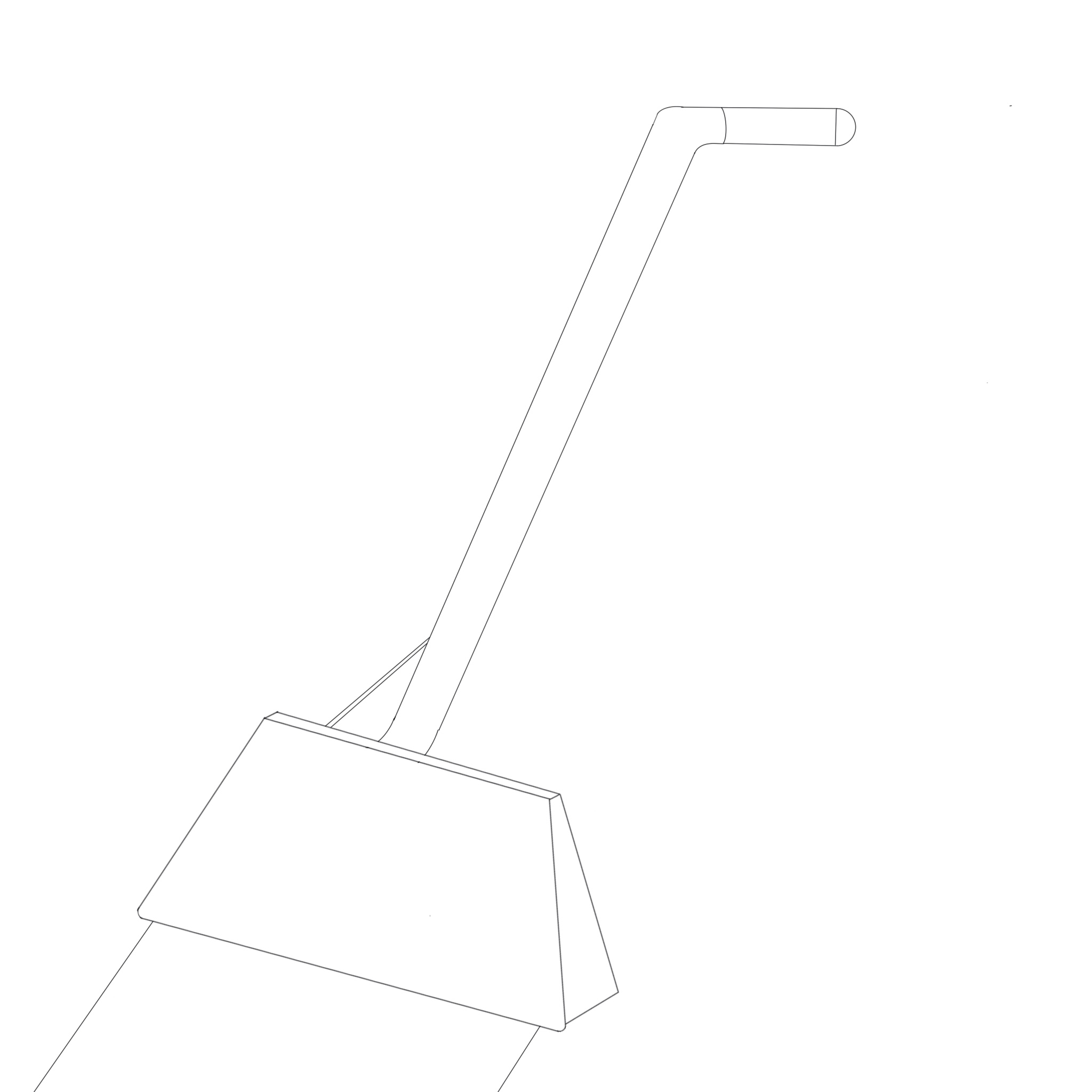
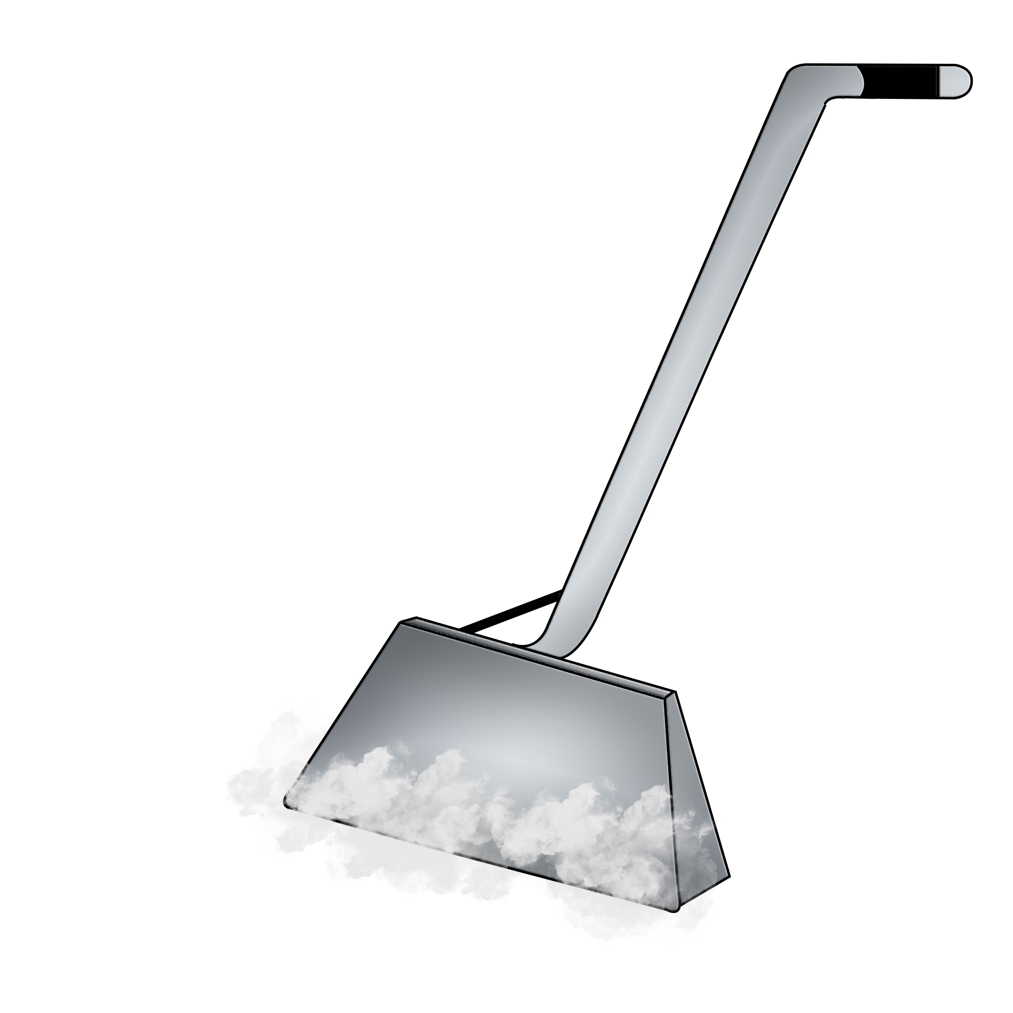
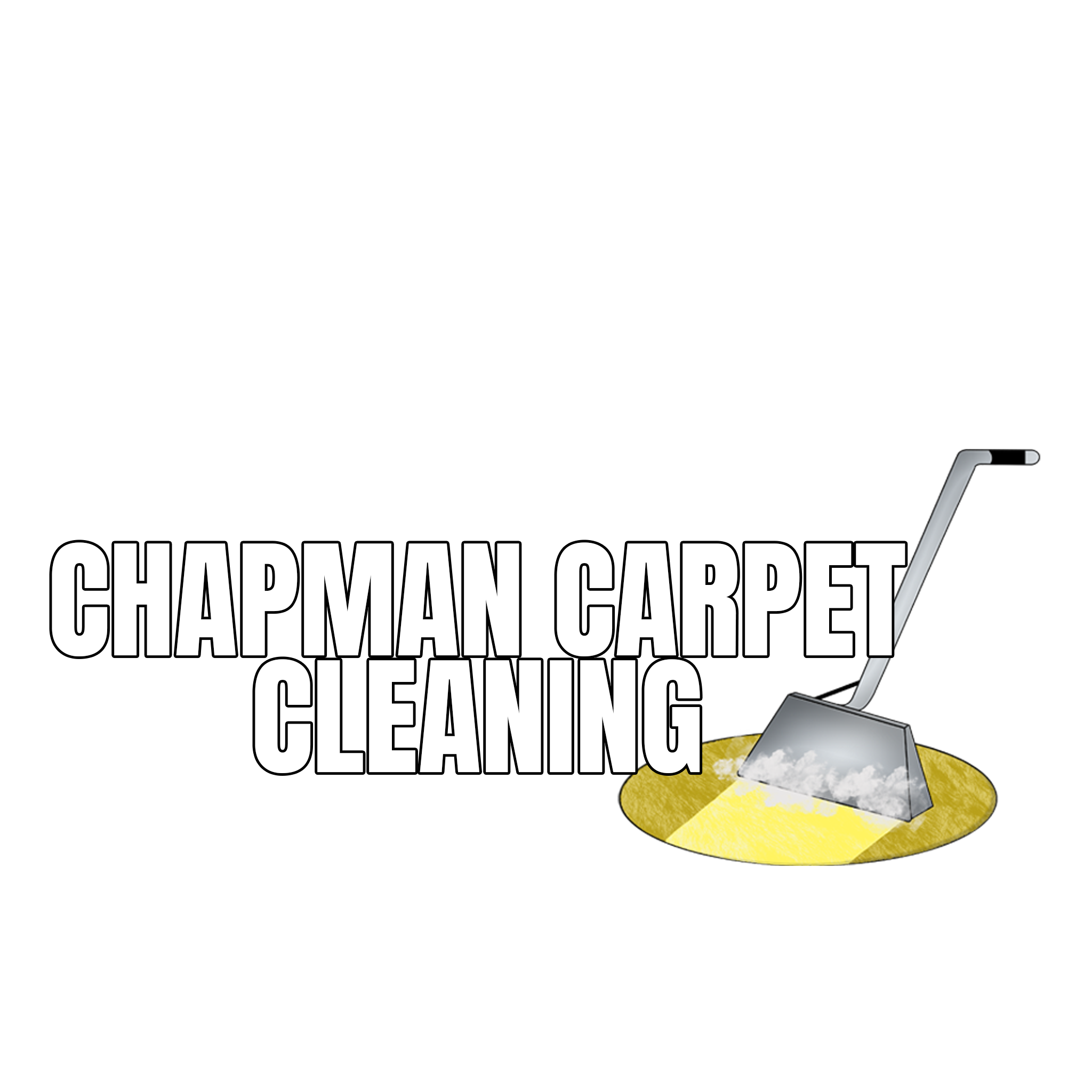
- A quick sketch created in Procreate. The main purpose was to get the lines down so I could build it up in Photoshop.
- The wand was built in Photoshop using the Wand tool. The colors are gradients of various greys to give it a metallic look. For steam, I used a brush to symbolize steam cleaning.
- I added Chapman Carpet Cleaning because that’s the company name. I added a carpet to bring in a pop of color and make it more obvious that it’s a carpet-cleaning business.
Step 4:
Feedback
- It’s “Chapman’s Carpet” and not “Chapman Carpet Cleaning”.
- To look up commercial business logos
- Connect the wand to a letter
- The Cleaning wand looks like a broom at first glance
The Result:
The result was a school assignment and not affliated with the company.
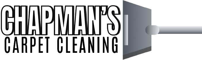
Designed for use on T-shirts, merchandise, and other promotional materials. .
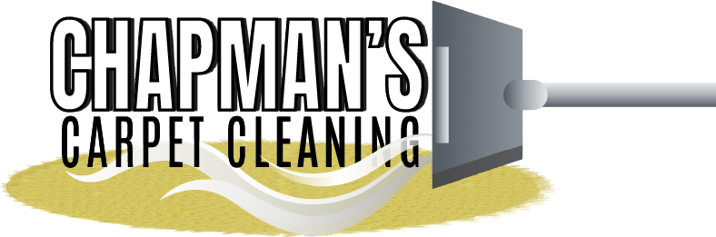
Designed for use on business cards, company vehicles, and other branded materials. .
The Outcome:
Two logos for business inquiries that could be used for visual purposes, or let’s say, on a shirt. I learned how to use Adobe Illustrator better. Between navigating the program and creating 3D things.
Let’s Work Together
Emily’s Designs and Things
Just letting creativity lead the way.
©2026 Emily’s Designs and Things | All Rights Reserved

